Onboarding & Subscreen
From clearer music choices to a personal practice plan. Six A/B experiments exploring how onboarding and subscription design affect ARPU.
Experiment 01
Clearer choices, less visual noise
- Problem
- Dense lists made instruments and genres difficult to scan.
- Hypothesis
- Visual genre and artist choices are familiar from services such as Spotify and Apple Music.
- Goal
- Make preference selection easier to understand.
- What was done
- Replace dense lists with recognisable icons, artist portraits and clearer selection states.
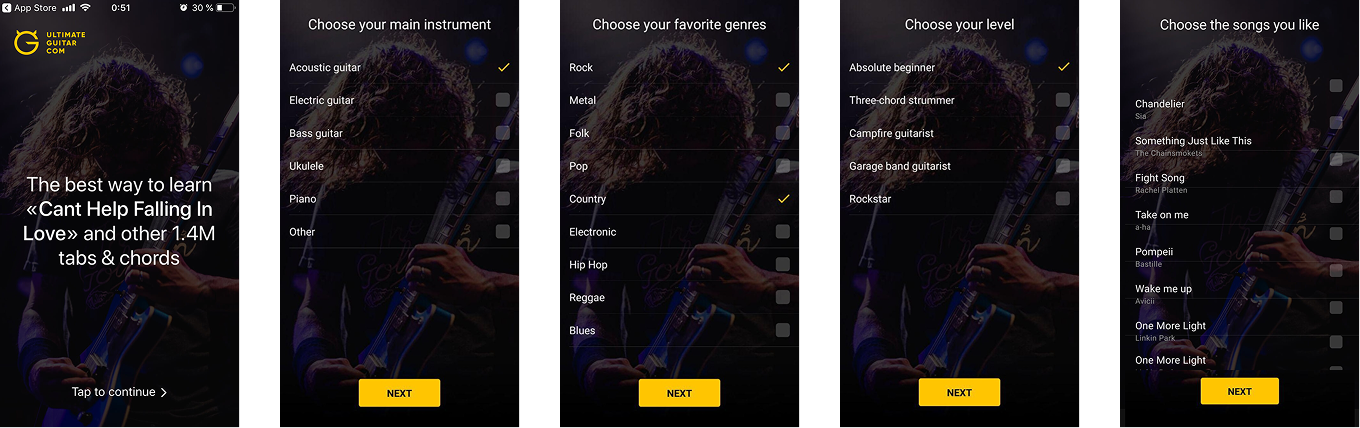
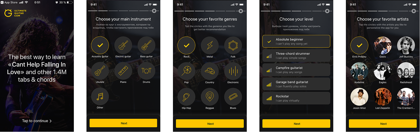
Statistical significance: 92%
- Conclusion
- Familiar patterns from music services may have made onboarding easier to navigate. The modest uplift encouraged us to explore whether showing the value of personalisation could have a greater impact.
Experiment 02
Make personalisation visible
- Problem
- Users answered preference questions without seeing how those answers shaped the app.
- Hypothesis
- Showing preparation could make the promise of a personal experience more tangible.
- Goal
- Communicate the value of the answers before the offer.
- What was done
- Add progress screens explaining how songs and recommendations are being selected.
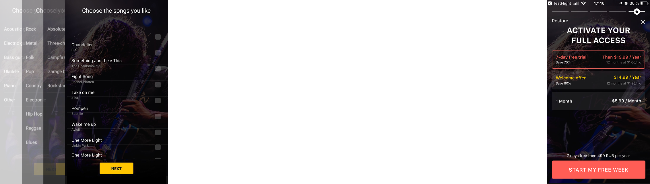
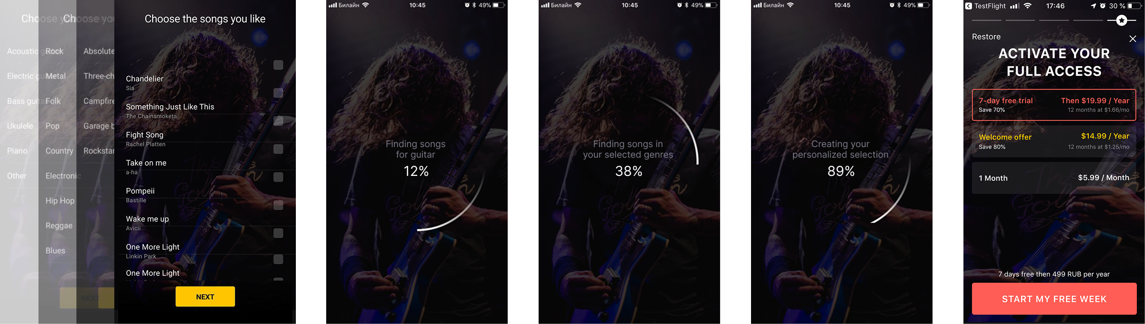
Statistical significance: 90%
- Conclusion
- Low contrast and hard-to-read copy may have left users unsure what was happening or why personalisation would benefit them.
Experiment 03
An app made for your music
- Problem
- The first preparation sequence had not communicated enough personal value.
- Hypothesis
- Artist artwork could make the promise feel more connected to the music users love.
- Goal
- Make the transition from preferences to a personalised app more convincing.
- What was done
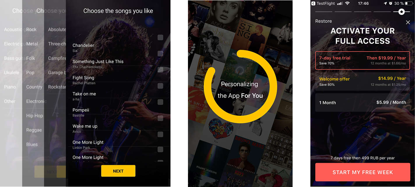
- Explain why we ask about songs and add an artist-cover preparation screen before the subscription offer.
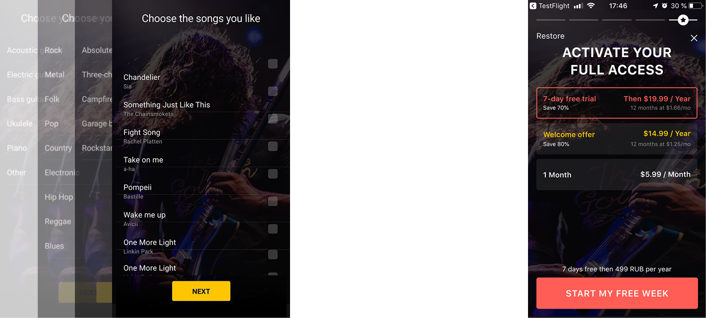
Statistical significance: 95%
- Conclusion
- Artist covers may have made the app feel like a personal fit, suggesting that music for practice had been selected specifically for the user.
Experiment 04
Carry the promise into the offer
- Problem
- The personalised preparation screen led to a visually generic payment screen.
- Hypothesis
- Keeping the artist artwork could connect the offer to the experience just promised.
- Goal
- Keep personalisation consistent through the subscription decision.
- What was done
- Use the same artist-cover background on the payment screen.
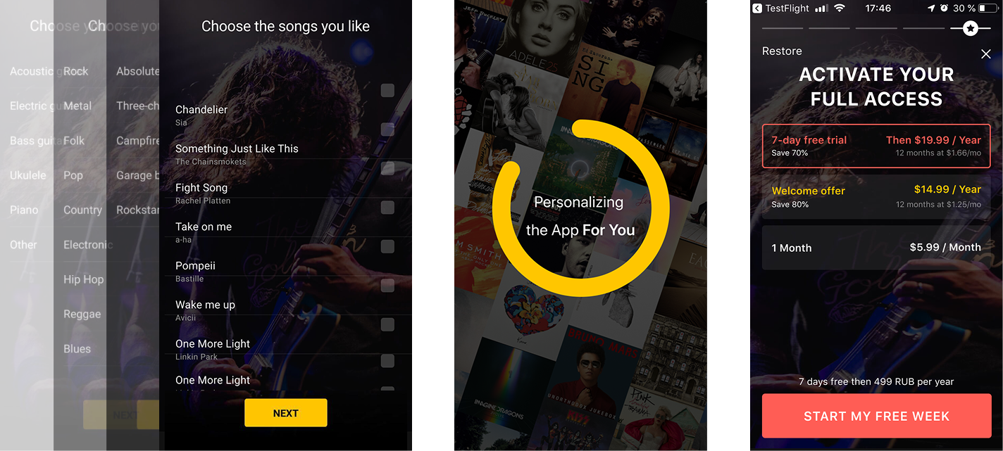
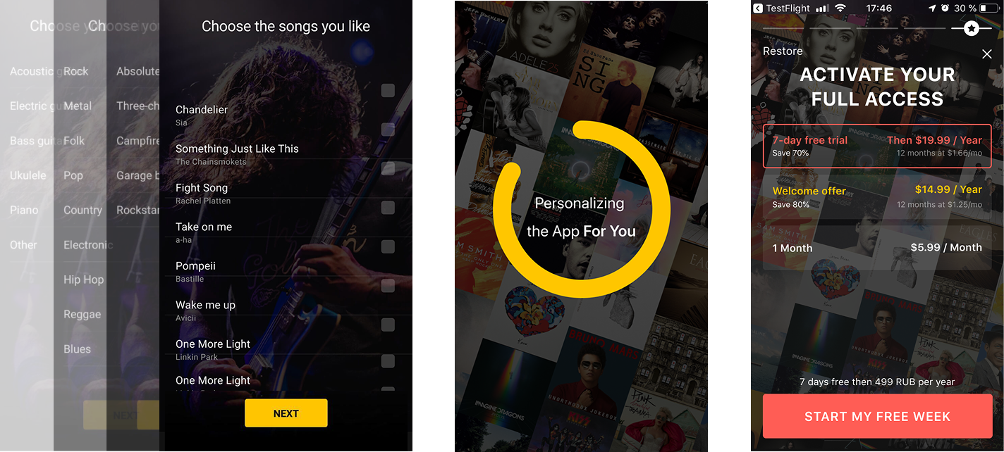
Statistical significance: 97%
- Conclusion
- Keeping favourite artists on the payment screen preserved the personalisation context and may have made payment feel like the next step to access that tailored experience.
Experiment 05
Turn motivation into a practice plan
- Problem
- Beginners wanted to play music they loved, but lacked a clear path to progress.
- Hypothesis
- A realistic practice commitment can connect effort to an achievable milestone.
- Goal
- Make learning progress feel personal and attainable.
- What was done
- Added a weekly practice choice and a graph showing the path to the next skill level.
Research
My approach. Segment the audience, understand their motivations and challenges, then design a personalised experience for the selected groups.
What beginners dream about. Analytics showed that 60% of the audience we needed to influence were newcomers to music. Qualitative research revealed two motivations: play a favourite song and perform popular songs for friends.
What gets in the way. Progress feels slow, regular practice is difficult without a clear goal, and a favourite song can be too challenging. When the effort is greater than expected, beginners quit.
From research to a practice plan. Six music teachers recommended regular practice and a minimum weekly commitment. I developed around 40 personalisation ideas from these findings. In this experiment, users chose their weekly practice time, and a graph showed how many months it could take to reach the next level.
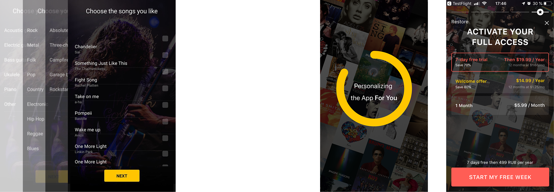
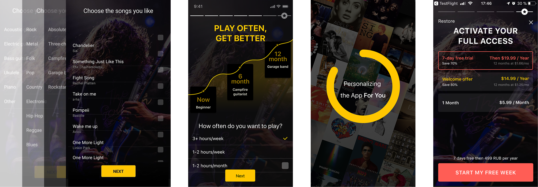
Statistical significance: 95%
- Conclusion
- Seeing a timeline to the next level and clear practice steps may have made long-term learning feel achievable, turning the subscription into a commitment to keep practising.
Experiment 06
From a plan to a reminder
- Problem
- A practice plan still needed to become a regular habit.
- Hypothesis
- We hypothesised that motivated learners would want a reminder after choosing a plan.
- Goal
- Help users turn their intention into a practice routine.
- What was done
- Offer a daily reminder after the practice plan and personalisation screen.
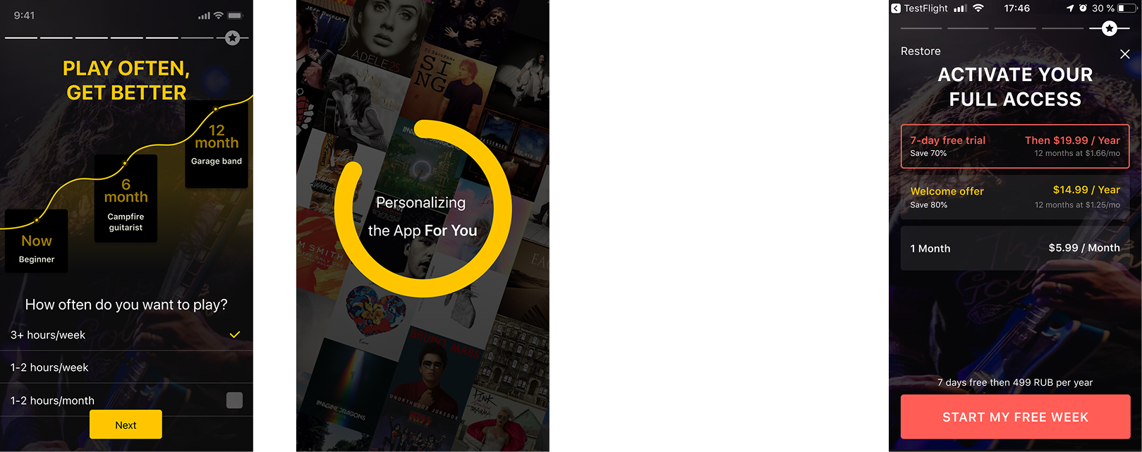
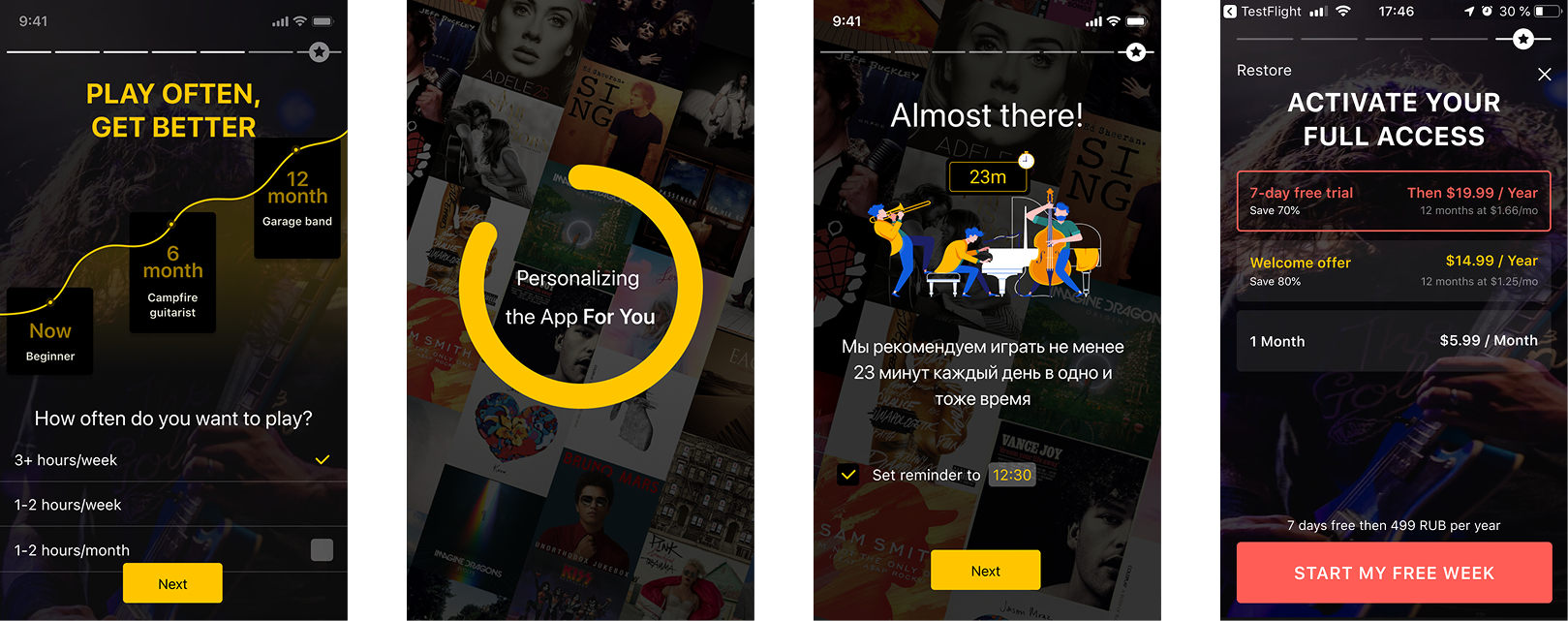
Statistical significance: 86%
- Conclusion
- Users may not be ready to commit to reminders before trying the app, or know a fixed practice time when their routine depends on the day and their mood. A next test could offer reminders again after their first tab view.